|
|
 |
Simulation |
 |
-
Fractals |
 |
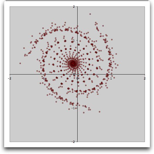
The remarkable picture
below is called a Fractal. Its points were computed with the
Simulation add-in using two sets of two-dimensional equations.
The chart was constructed automatically using the chart option
of Excel.

|
| |
The fractal is constructed using
Iterated Function Systems (IFS). The theory of the process is
described in a paper by J. C. (Sprott, J.C., Automatic
Generation of Interacted Functions Systems, Computers and
Graphics, Vol. 18. No. 3, pp 417-425). The 16 examples built
into the add-in are from this paper. The Sprott
web site has many illustrations
of fractals including the ones programmed into the add-in. |
| |
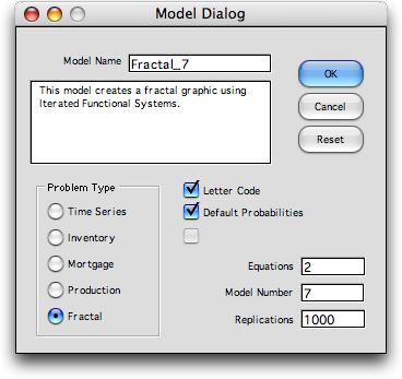
To construct a fractal click the Fractal button
in the model dialog. The Letter Code and Default
Probability options are best for the new user. All the
examples use 2 equations, but more equations can be used. The
Model Number refers to the models described in the
Sprott paper. A number from 1 to 16 should be entered. The
model parameters can be changed after the worksheet is constructed.
We use 1000 replications for the example, but that number can
be changed. After this dialog is accepted a second dialog sets
the parameters for the simulation. Click OK to accept the options
provided.

|
| |
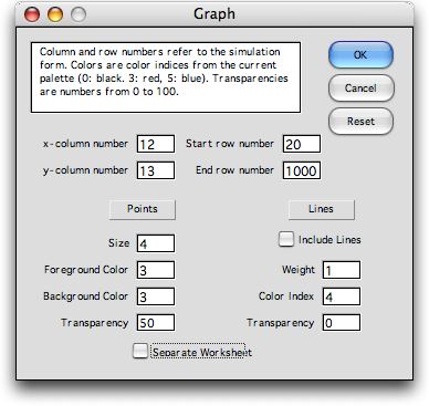
After the worksheet is constructed, a third dialog
follows with the options for the graph to be constructed.
We start the graph at row 20 to reject initial
transients. You can experiment with the line and point parameters,
however, the parameters shown give the graph at the top of
this page. The Include Line option connects
adjacent points, but the lines tend to confuse the chart.

Finally,
pressing the OK button of the Graph dialog constructs
the worksheet and builds the chart.
|
The Worksheet |
| |
We use the example to describe
the worksheet and show how the method works. In the figures,
some rows and columns are hidden for clarity. The hidden rows
and columns may be unhidden be the Unhide commands on
the Format menu.
We see at the top of the worksheet the usual information about
the simulation model. Clicking the Change button allows
the number of iterations to be changed. Clicking the Simulate button
regenerates the model with a new random number seed. Clicking
the Chart button presents the Graph dialog
shown above so the chart parameters may be changed. |
| |
|
| |
The method of Iterated Function
Systems uses sets of linear equations also called linear
affine transformations. In two dimensions the general equations
are below, where a, b, c, d, e,
and f are numerical parameters. The equations will
be solved iteratively with (x, y)
indicating the current point and (x', y')
the next point.

The first set of equations used for the example
has the parameters a through f in row 19 of
the worksheet.

Following Sprott, the parameters are represented
by a letter code where A represents the value -1.2, B is -1.1,
and so on. Each subsequent letter adds 0.1 to the parameter
value. Thus Y represents the largest value of 1.2. A little reflection
will convince you that the letter code in row 15 is equivalent
to the numeric code in row 19. The formulas in row 19 perform
this translation. Using letter coding a particular pair of
linear equations is represented by a sequence of six letters.
Thus, the first set of equations is KJPSVU.
The method uses two or more of these sets of equations.
The built-in examples all use two sets. The second set for the
case below has the code HDVJNR. Translating the letters we obtain
the equation set:

|
|
| |
The method is applied sequentially.
We start at an arbitrary solution, say (x, y) = (0,0).
One of the equation sets is chosen at random, say set 2. Using
(x, y) = (0,0) we
compute (x', y') = (0.1, 0.5). Now we let (x,
y) = (0.1, 0.5) and again choose set 2 to find the new
point (x', y') = (-0.4, 0.44). . Now we let (x,
y)
= (-0.4, 0.44) and choose set 1 to find the new point (x',
y') = (0.848, 0.944).
We use the figure below to illustrate the process. We are
choosing the equation sets at random with equal probabilities. The
figure below shows a sequence of 13 iterations. At each iteration
we draw a random number as shown in column F. If the number
is less than 0.5, set 1 is used for the transformation. If
it is greater than 0.5, set 2 is used. The three calculations
illustrated above are shown as the first three rows of the
table. |
|
| |
It happens that choosing the set
with equal probabilities does not result in a very good chart.
Rather, it is better to choose the sets in proportion to their
relative determinants of the Jacobian matrices. The determinant
is:

The determinants are computed in cells O18 and
O19. For the example the determinants are 0.03 and 0.96. Since
these do not sum to 1 we use the probabilities 0.03/0.99 =
0.0303 and 0.96/0.99 = 9697 for the selection. For the example,
it is much more likely to choose equation set 2 for the transformation
than set 1. The first 13 transformations all use set 2. The
sequence depends on the random number seed, so every time the
simulation button is clicked a new series is generated.
|
|
| |
It is interesting that the chart
at the top of the page looks very much the same for every sequence
and for every starting point. We skip the first 20 transformations
when building the chart, so that the initial conditions do not
have much affect.
The two figures above show how the add-in handles the computations.
The random number determines the equation number and formulas
transfer the equation coefficients to the body of the table
in columns H through M. The values of (x, y), in columns
N and O, for one iteration are set equal to the values of (x',
y'), in columns P and Q, for the previous iteration. Columns
P and Q compute (x', y') from the coefficients in columns
H through M. |
Selecting Parameters |
| |
The entire computation is dynamic.
Changing any equation parameter or the initial point changes
the entire table and the attached chart. This makes it easy
to experiment with other parameter selections.
It is amazing that simple linear equations, solved repeatedly
with random selection results in such interesting graphs. It
is unfortunate, however, that many affine transformations result
in charts that appear as randomly placed dots. The purpose
of the Sprott paper referenced above was to automatically generate
"good" sets. Sprott generated all possible sets using the letter
scheme noted above and discovered 16 sets that gave interesting
pictures. He represented the equation pairs by concatenating
the two 6 letter sequences into 12 letters. Series 7 used for
the example has the code: "KJPSVUHDVJNR". The complete
set is below.
"GNGUVETDSNWK", "GOHRHRNVFLNO", "IFEROWOSIRQI", "IIDQIKFMNUSK",
"IPUDJIHVEIQY", "KDOWQMMYEMWD", "KJPSVUHDVJNR", "KWMRVRUCOWWB",
"LGMRYBSCSSQR", "MCGMGGJQORXH", "NYDEQPKLOOKY", "RFUSIENLJVCN",
"RIGIEDMIBOWR", "TLPVPLMQEIFC", "TTGUJNMRLWBR", "UIPUDROEPLPM"
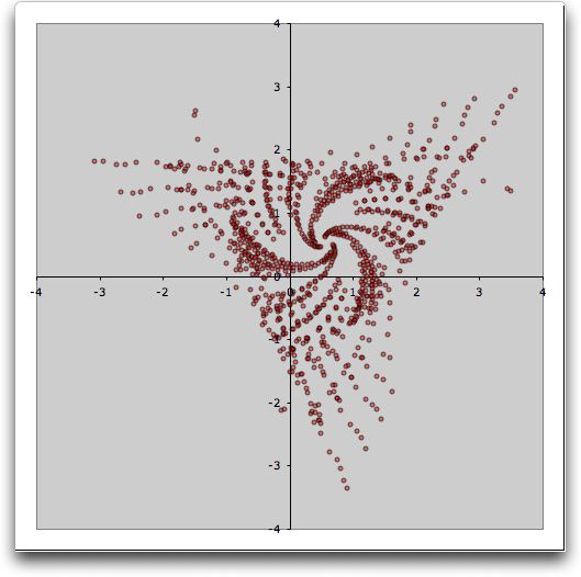
The chart for set 5 is below. More iterations provides a more
detailed figure, but takes more time to generate. Try the other
series to get a complete set of charts. Experiment with more
iterations and try three or more equations.

|
| |
|
|


